Photo by Jim McIsaac/Getty Images; click to enlarge
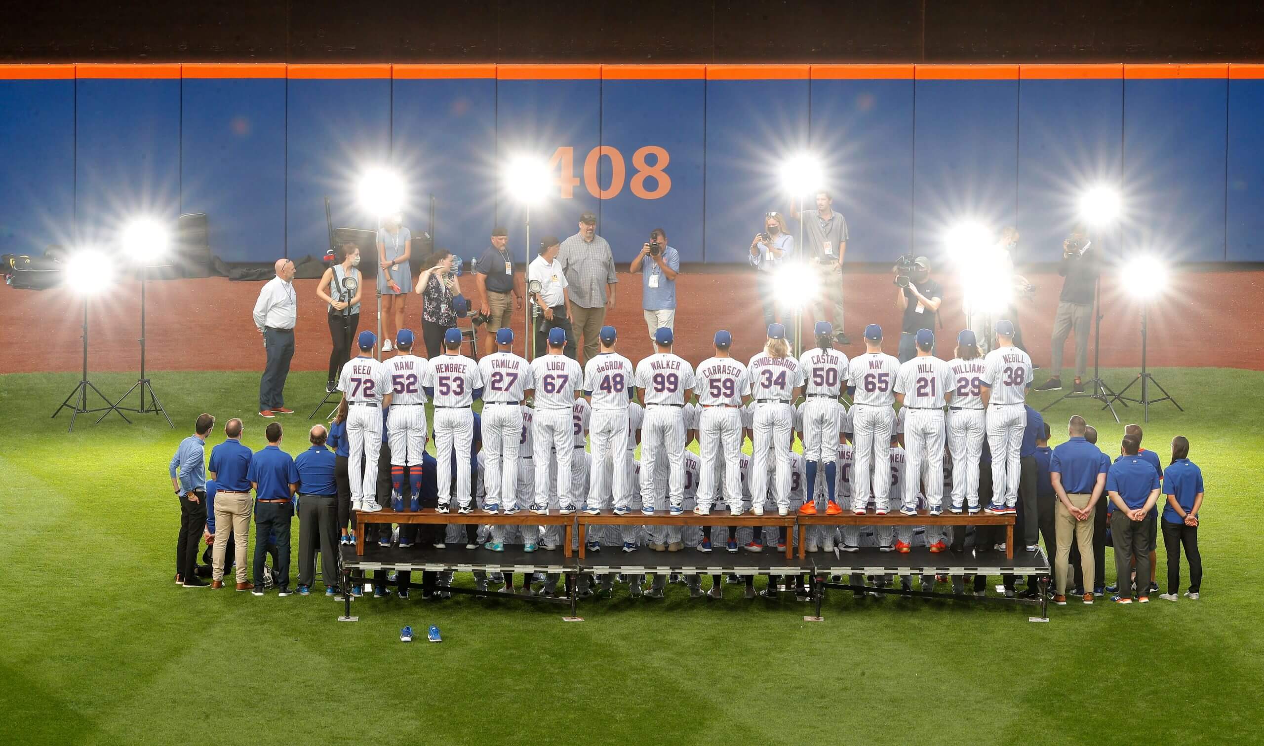
Here’s something you don’t often see: a rear view of a photo shoot for an MLB team portrait, taken prior to Tuesday night’s Mets/Cards game at Shea. Nice job by Getty shutterbug Jim McIsaac to capture that moment.
A few notes of interest:
• Man, look at all those lights they have set up — and that’s on top of the stadium lighting!
• The players in the back row are all pitchers (but they are not all of the team’s pitchers).
• Those pitchers in the back row include Jacob deGrom (who has not pitched since July 7) and Noah Syndergaard (who has not pitched since 2019).
• Reliever Brad Hand (No. 52, second from the left in the back row) appears to be posing in his socks, with his shoes on the ground behind the riser.
• Don’t even get me started on the Mets’ woeful lack of high-cuffery.
• As much as I love the rear view, it’s killing me that we can’t see the front view, and here’s why: As mentioned in yesterday’s Ticker, MLB teams wore yellow ribbons and wristbands for pediatric cancer awareness on Sept. 1, but the Mets were rained out on that day so they wore the gold accessories on Tuesday night — the same night this team portrait was taken. So did they wear their regular non-ribboned jerseys for the team portrait and then change into the ribbon-clad jerseys for the game, or will future generations be wondering why all the players were wearing yellow ribbons for the 2021 team portrait? We need to get a front view!
Finally, I know this may seem like a silly question, but why do teams take a team portrait so late in the season? I think they also do one early in the season, or even in spring training, and I can understand why they’d do one prior to their first playoff game, if they get that far — but what is the purpose of a team photo taken in mid-September? I’m sure there’s a good answer to this question, so someone please tell me what it is!
Update: Twitter-er @_bbbene has pointed me toward some front views of the photo shoot:
A 👀 behind the scenes of photo day. pic.twitter.com/x45Omrh6ln
— New York Mets (@Mets) September 16, 2021
So they did not have the yellow ribbons! That means they either changed into new ribbon-clad jerseys after the photo shoot, or else they just used peel-and-stick adhesive ribbons that were applied to the regular jerseys after the shoot.
(My thanks to Derek Linn for noticing Brad Hand’s shoes.)

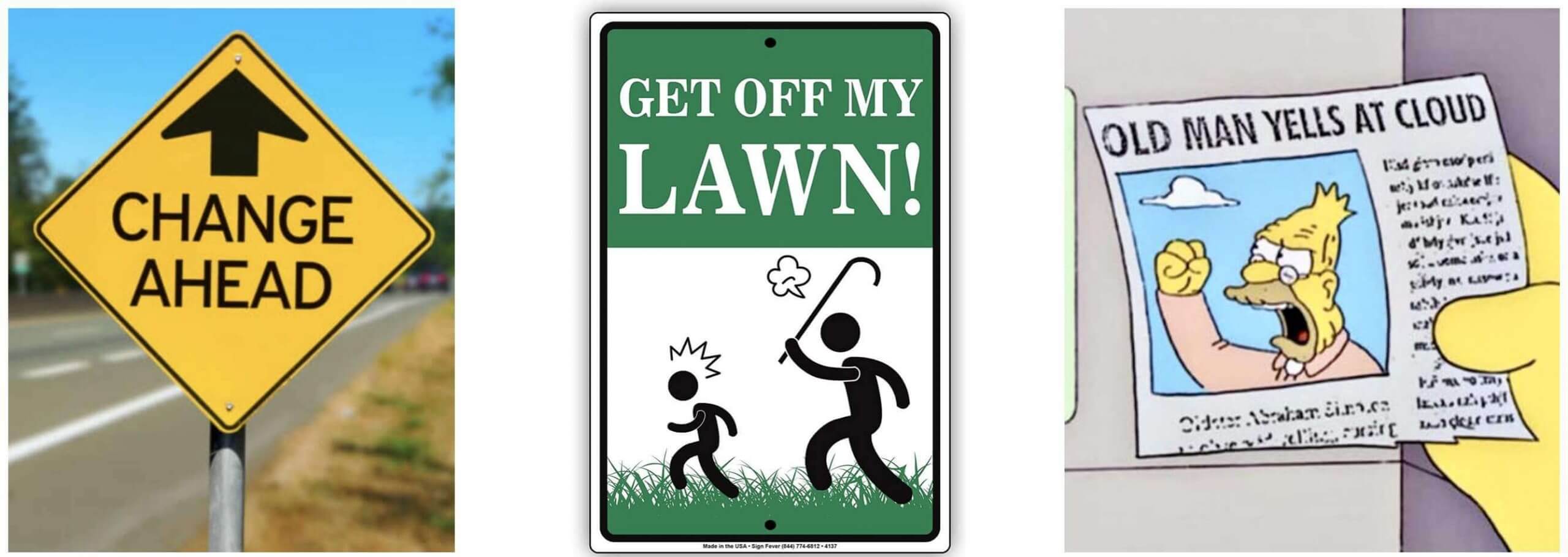
ITEM! New Bulletin article: Whenever I critique a newfangled uniform or a new uniform “innovation,” a certain subset of readers will say, “You just hate anything new!” or “You just hate change!” So for my latest Bulletin article, I decided to try out a thought experiment to see how I would have responded to some major developments uniform history. For example, if I had been writing Uni Watch in the late 1920s, how would I have felt about the advent of MLB uni numbers? I tried to be as honest as possible with a bunch of hypotheticals like that.
Those of you who’ve subscribed to receive my Bulletin content via email should already be seeing this piece in your in-boxes. Everyone else can read it on my Bulletin page. Enjoy!

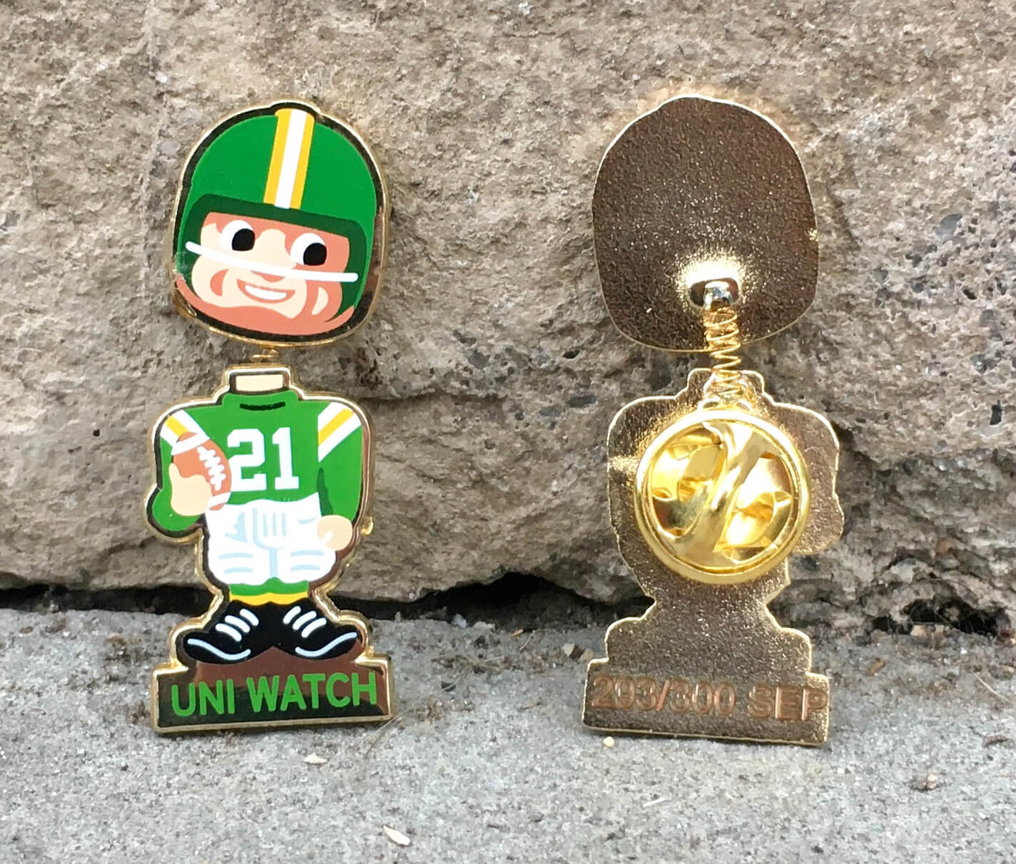
LAST DAY for the Teespring flash sale: Today is the last day that you can save 20% on our September bobble-pin (and on everything else I sell on Teespring) by using the checkout code BOBBLE20. You know what to do!

“What’s It Worth?” reminder: In case you missed it earlier this week, I’m once again partnering with Grey Flannel Auctions to offer free, no-obligation appraisals of your vintage sports memorabilia items. Full details here.
The Ticker
By Anthony Emerson

Baseball News: Contrary to what Paul wrote in yesterday’s lede, it turns out that all of the Dodgers — not just Justin Turner — had the Roberto Clemente patch awkwardly positioned on the left sleeve. [My bad on that, obviously, but what fooled me is that starting pitcher Julio Urias didn’t have the patch. — PL]. … Powder blue vs. royal blue for last night’s Phillies/Cubs game (from Eric Nits). … The Midland RockHounds, Double-A affiliates of the A’s, will have a new logo soon (from @wilds_lee).

Pro Football News: The Rams’ social media guy designed the team’s hugely popular new end zones (from Todd Usher and Marcus Hall). … WFT went white at home last night (from multiple readers). … The Ravens are going black-purple-white against KC (from Andrew Cosentino). … The BC Lions have drafted artist Corrine Hunt to create an indigenous heritage logo for the team (from Moe Khan and Wade Heidt). … Bengals WR Tee Higgins will stop wearing No. 85 after this season because he doesn’t want to be viewed as the “2.0” version of Chad Ochocinco.
College Football News: WR Kaleb Smith will wear Frank Beamer’s No. 25 for the Hokies this weekend (from Andrew Cosentino). … Here are this weekend’s unis for Mizzou, Virginia, Florida A&M, Michigan State, Troy (the first time the Trojans are wearing a white facemask), Georgia Tech, Texas State, UNC, West Virginia, LSU, Ohio, Tulane, ASU, Louisiana, Oregon, Ole Miss, Tennessee, Cuse, Boise State and Indiana (thanks to all who shared). … Purdue’s marching band won’t have the World’s Biggest Drum for this weekend’s game at Notre Dame because the drum is too big for the visitor’s tunnel and the Irish won’t let them use the home tunnel. It will be the first time since 1979 that the band will not have the drum.

Hockey News: The Blackhawks are adding a memorial chest patch for Tony Esposito (from multiple readers). … Kraken G Chris Driedger has some really awesome pads for this coming season (from multiple readers). … Here’s a very satisfying video of Colorado Eagles staff painting the blue line.

Hoops News: The Delaware Blue Coats, G League affiliates of the Sixers, unveiled a new identity earlier this week (from @TrueColorNet). … Here’s our first look at UCLA’s new Jordan Brand unis (thanks, Phil).

Soccer News: Dinamo București of Romania’s men’s top division took the field the other day carrying rescue dogs to encourage adoption. … West Ham was without a shirt advertiser during their Europa League match against Dinamo Zagreb, as Croatia limits gambling advertisements (from Jason Collins). … Ajax’s home kits don’t feature NOBs this year, but they are required to add them for European competition. UEFA is also mandating that their uni numbers be outlined in black, and the three stars on the back collar be replaced with the crosses of the Amsterdam flag (from Trevor Williams).

Grab Bag: Arlington County, Va., has chosen four finalists for its new logo (from William F. Yurasko). … I’ve never seen an apostrophe catastrophe quite like this grocery store’s sign in Edinburgh, Scotland. I guess the workers thought it was a comma? (From Stephen Langdon.)
And that’s a wrap for this week. Stay well, enjoy Phil’s weekend content, and I’ll see you back here on Monday morning. Peace. — Paul
A mid-September team portrait is a more accurate reflection more often than not of the roster fans got familiar with over the course of a season. The preseason photo doesn’t have folks acquired at the trade deadline, AAAers making their debut in May, Sept call-ups, etc etc
I was just about to say, a September team portrait is a good chance for a “cup of coffee” call-up to have his stint memorialized for his grandkids. Plus, this way you’re definitely after the trade deadline also
But what would such a photo be used for? Where would it be published? The yearbook has already been printed, the season is almost over, etc.
There are plenty of places in the sports media ether that have compilations of year-by-year team photos. The next season’s media guide, hallways of the front offices, spots in the stadium even maybe. I’m just trying to think of the various places where I’ve seen team photos, and they’ve hardly ever been at the start of that exact season in that season’s program. In all the other spots, I can understand where using the later-season photo is more sensible.
Playoff/World Series programs have not yet been printed.
Yes, it is not likely for the Mets, but stranger things have happened.
And I would imagine most teams’ spring training/opening day or even mid-season team pix would not always be representative of their team should it make the World Series.
Would a city or team newspaper include a keepsake photo as an end-of-season/post-season title giveaway item (perhaps “compliments” of an advertiser?)?
Formula 1 also does a drivers’ group photo at the first and final races each year, but I don’t know the reason why.
link
That photo immediately link that the Orioles used in 1968 on billboards and ads.
Vertical arched brilliance!
Bud’s feedback above is correct. And per your question to me on Twitter, the photo is taken more for posterity than for any specific use. Really, when are team photos used anyway other than to capture the team at a certain place and time?
Another question…. why did #52 take his shoes off? They appear to be in the grass behind the risers.
Good spot! I’ll add that to the text.
Was Hand the only player in cleats with everyone else in sneakers? If so, perhaps they don’t want cleats on the risers. Players wear cleat on solid surfaces all the time, so I’d guess, if that’s the reason he was in socks, it might have been to protect the risers.
Does anyone else get an Old Navy ad right in the middle of the page that totally covers up the bobblehead pin photo?
Dave, please send me a screen shot: link
Purdue – Notre Dame:
Has something changed at the ND stadium? Purdue plays there about every other year.
Purdue hasn’t played at ND since 2012. Renovations since then require visiting team and visiting band to use a different tunnnel that is not big enough for the drum.
Purdue’s drum is kind of silly – especially now with the big ad, but that is not a very Christian thing for Notre Dame to do!
ND won’t let Purdue use the entrance the big drum will fit through. One more reason to loathe ND…
What he said. It’s just spite.
Last night’s NYG-WFT game featured a whole lot of uniform numbers. Each team had two sets of numbers on their helmets, two TV numbers, and the usual front and back. Six sets of numbers per player, 132 sets of numbers at any time on the field.
With WFT presumably replacing their helmet numbers with a logo and more teams ditching the TV numbers, I wonder how many times you will see each team with six sets of numbers?
The Steelers still wear front and back numbers on their helmets (similar to the Giants), and I don’t see them changing that any time soon.
So…Every school in the Big Ten should ban Notre Dame from travelling with a band until they formally apologize to the Purdue students. They are in-state rivals, playing the big drum at Notre Dame might be a life dream for some of these Indiana kids, and Notre Dame is insisting on being all pious about a drum?
I’m an ND fan but this is the stupidest thing I’ve ever heard. Purdue’s engineering school should be trolling hard that Notre Dame can’t figure out how to get a 10 foot drum through a 20 foot tunnel.
Really enjoyed the Bulletin article. I don’t know why, but reflection/self-analysis pieces always make me happy, whether I agree with their conclusions or not. Maybe it’s because I feel like self-reflection is such a valuable and rare behavior in today’s culture.
As for myself, I think I’m the opposite of Paul. I tend to err on the side of embracing change. I guess my natural personality is to get enamored with the latest new shiny thing coming down the pipe, regardless of whether said thing is actually any good or not. So I often find myself in a situation where something new really appeals to me at first, but then a couple years later, I find it stupid and wonder how I ever liked it.
I don’t think Paul hates change, per se (He does hate the color purple, this much is clear). No, I think Mr. Lucas has a very particular uniform aesthetic and is critical of anything that deviates from it, while praising trends that move toward it. I’m not sure what it is, exactly, but it surely involves chain stitching, primary colors, proper blousing and absolutely no sponsorship ads. The trouble is that if every team conformed to his vision, I fear the result would be a bland, dare I say it, uniformity.
Oh dear. I may have just unintentionally admitted that I don’t “get it.” Ban me!
I disagree.
I haven’t read the article yet so I might be completely off base, or repeating what’s there.
The mantra I get from Paul is “is it cool, or is it stupid?”
If its a stupid change – black for black sake, one more bumper sticker, he’s against it.
If its cool – all for it.
I don’t see advocacy for a certain look, or uniformity, only for changes that aren’t stupid.
It’s not just Paul but most of the folks who comment here seem to have a negative reaction to any innovative or unique design changes in uniforms. Then, people seem to gradually get used to them. Then they become “iconic”, given enough time.
There was a guy named Daniel Tarrant who used to comment a lot around here, and he had a theory that the most important determinant of whether a uniform is seen as “good” or “bad” is how long it’s been worn – that all uniforms become “good” after they’ve been used for a long enough period of time.
I think he was spot-on and have had the same thought myself. Unfortunately he made the mistake of calling his theory the “Tarrant Theory” (a perfectly reasonable move IMO), and he got blasted by a bunch of angry commenters who apparently saw him as egotistical. I never saw him comment on here after that, which may or may not be coincidental.
Nothing to do with uniforms, but I’ll always love the orange trim in the Mets Stadium. I’ll always admire something that’s unique and different
The team photo was taken on the 14th – not at start of the month. That answers all the yellow bracelet questions you had…I’m in the shot in case you are wondering how I know :-)
Um, yes — as I explained right there in the text, the Mets wore the yellow ribbons on the 14th, because they were rained out on Sept. 1.
After seeing Chris Driedger’s pads, I’ll be routing for him to be the Kracken’s No. 1 Goalie.
I know this isn’t a sports “rant” site – but Brad Hand is a stiff, he cost the Blue Jays a decent catching prospect, hitting well for the Nationals and was cut two months later.
Can we all just refer to the Mets ballpark as “Shea”?!
Hmmm…if only there were a place on the internet to buy a T-shirt proclaiming this.